Peter Pan Donuts Case Study
Peter Pan Donut & Pastry Shop —
A Mobile Responsive Redesign
Overview
Peter Pan Storefront
The Challenge
We were tasked with redesigning the website for Peter Pan Donut & Pastry Shop, a Brooklyn favorite in Greenpoint for the last 60 years.
This was a Lean UX project designed and developed in collaboration with a team of developers.
Shop History
The shop was opened over 62 years ago and bought by its second owners 30 years ago.
In that time, the current owners chose not to change much about the design — from the menu signs to the counter setup and employee uniforms — this was a conscious choice made to become part of the shop’s branding and identity.
evaluation
Heuristic Evaluation
Group Evaluation
We conducted a heuristic evaluation of the website to identify what was already working on the website and what could be improved.
Users could easily identify the product and navigate throughout the site. It was valuable in providing contact details and an online donut menu.
Delightfulness was evoked through the site’s old school style and numerous product and shop images.
However, the site was slow to load, likely due to the numerous animations and graphics on the home page. The number of animations likely affected usability and clarity as well.
We also determined that we could improve usability and clarity by simplifying the site’s information architecture and adding hierarchy & consistency across text and images.
ORIGINAL SITE DESIGN
Research
Peter Pan Donut staff in uniform
We conducted research on Peter Pan Donut’s brand and identity to ensure that our redesign did not take away from the identity that has made it one of the top donut shops in America.
We wanted to know, how can we redesign the website to cater to customers’ expectations of Peter Pan Donut’s existing brand?
User Research
Design team & shop owner
To better understand the shop’s users, we traveled to Greenpoint to experience Peter Pan Donuts for ourselves.
Indeed, the shop looked as if it had been frozen in time, the menu signs, counter, and employee uniforms all reflected the time period in which the shop was founded. It all contributed to the shop’s timeless charm and appeal.
We talked to some of the customer’s in the shop and learned that they were long-time customers. Many of them had grown up in the neighborhood and had been loyal customers for at least 20 years.
The customers loved everything about the existing shop, so we knew
our design had to reflect its same timeless identity.
Additionally, we learned that the shop was a hot spot for tourists. The shop is commonly featured in top donut shop lists on lifestyle & travel websites like the Food Network, Thrillist, and the New York Times.
Having a better understanding of our target users and the shop’s history, we were able to more clearly define our challenge.
OUR MISSION
How might we make Peter Pan Donut’s online information more accessible for existing and potential local customers as well as for tourists?
The Redesign
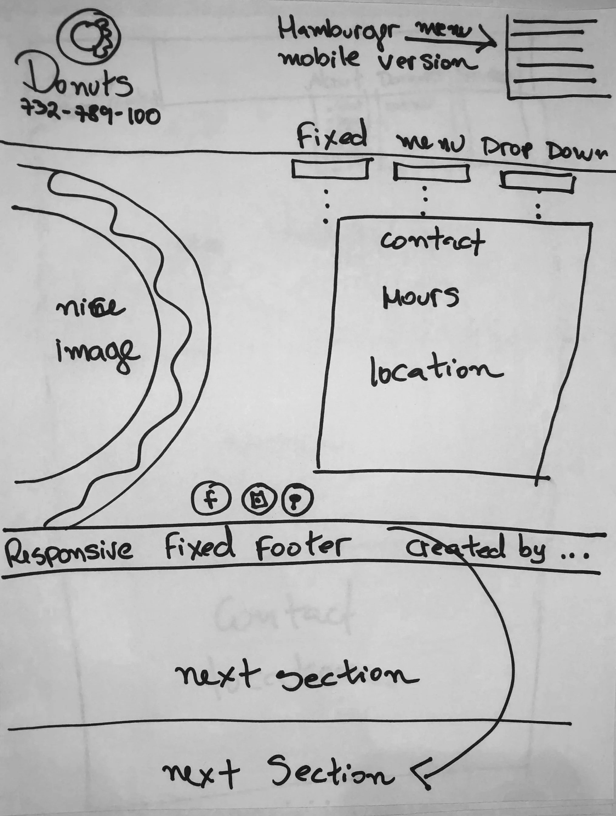
We began by conducting a Design Studio to come up with a lo-fi plan for the website. We decided to make it a one page site to maximize user friendliness and accessibility to information.
Branding
Inspired by the shop’s employee uniform, we decided to make teal and pink a major aspect of the new website’s branding.
We also chose a script font for the shop’s name to reflect an old-school vibe.
Navigation & Information Architecture
Working together with our developer team, we incorporated a sticky navigation bar so that it would be visible no matter where our users were on the site.
Nav Bar
The navigation bar linked to the most important information: Hours & Location, the Donut Menu, Contact Information, and of course, Peter Pan’s story and history.
In addition, location, hours, and contact links were placed through out multiple areas of the site to cater to various mental models. This information was located above the navigation bar, in the contact section, and again as a CTA button in the site’s footer to make it easier for mobile users to contact Peter Pan.
Mobile Responsiveness
Mobile Responsiveness was a key factor in improving the accessibility of the site, ensuring that mobile users would easily find important shop information.
The mobile version of the site also included a sticky header and footer, as well as a hamburger menu with the same links found in the navigation bar of the desktop site.
Peter Pan Mobile Site Header
Hamburger Menu
To experience the desktop and mobile sites, check out the video walk-throughs below.
The MVP
Peter Pan Donut & Pastry Shop’s
Redesigned Desktop Site
Video Walk-through
Peter Pan Donut & Pastry Shop’s
Redesigned Mobile Site
Video Walk-through


